vcdiversity.org – “Color and Form: The Designer’s Palette” is a concept that encapsulates the fundamental elements that designers use to create visual compositions. Color and form are two of the most critical components in design, each playing a unique role in how a design is perceived and interpreted by its audience.
Color
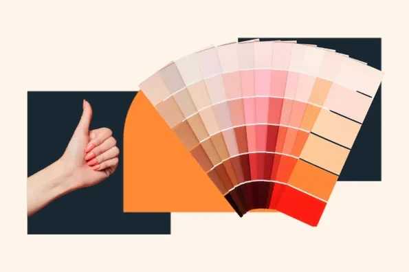
Color is a powerful tool in design that can evoke emotions, create moods, and influence behavior. It can be used to attract attention, highlight important information, and establish a brand identity. Designers consider various aspects of color when creating a palette for their projects:
- Hue: The pure color itself, such as red, blue, or yellow.
- Saturation: The intensity or purity of a color. Highly saturated colors are bright and vivid, while less saturated colors appear more muted or dull.
- Value: The lightness or darkness of a color. Adjusting the value can create contrast or harmony within a design.
- Temperature: Colors can be warm (reds, oranges) or cool (blues, greens), influencing the psychological impact of the design.
Form
Form refers to the shape and structure of objects within a design. It can be two-dimensional (2D), such as a flat geometric shape on a page, or three-dimensional (3D), suggesting volume and depth. Form is crucial for guiding the viewer’s eye through the design and for creating a sense of space and balance. Key aspects of form include:
- Shape: The outline or outer edge of an object, which can be geometric (circles, squares) or organic (free-form, natural shapes).
- Space: The area around and between objects, which can be positive (the space occupied by objects) or negative (the space around objects).
- Texture: The surface quality of an object, which can be real (tactile) or implied (visual). Texture adds depth and interest to a design.
- Line: A mark with length and direction, which can be used to define shapes, create patterns, and guide the viewer’s eye.
Combining Color and Form
The skillful combination of color and form is what makes a design compelling and effective. Designers must consider how these elements interact and complement each other:
- Contrast and Harmony: Using colors and forms that contrast can create visual interest and highlight important elements, while harmony creates a sense of unity and cohesion.
- Hierarchy: By manipulating color and form, designers can establish a visual hierarchy, guiding the viewer’s attention to the most important parts of the design first.
- Emotion and Meaning: The choice of colors and forms can convey specific emotions and meanings, reinforcing the message or theme of the design.
Conclusion
“Color and Form: The Designer’s Palette” underscores the importance of these elements in creating effective and engaging designs. Whether in graphic design, interior design, fashion, or any other field, understanding and skillfully applying color and form can elevate a design from ordinary to extraordinary.